The Big Copilot Cleanup Has Begun
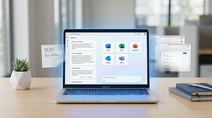
Microsoft 365 Copilot is getting a redesign, and the message is pretty clear: Microsoft wants its AI assistant to feel less like a crowded control room and more like a smart workspace.
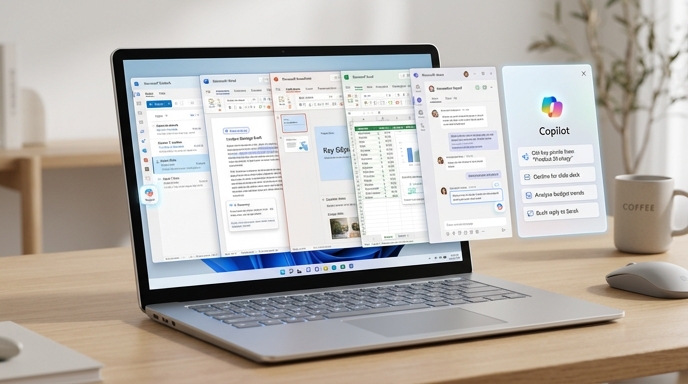
That matters. Copilot has shown up everywhere across Microsoft’s universe: Word, Excel, PowerPoint, Outlook, Teams, Windows, the web, mobile, and probably somewhere inside your printer if you look hard enough. The problem was not just that Copilot existed in many places. The problem was that it often felt like many different Copilots, each with its own mood, menu, and mystery buttons.
Now Microsoft is trying to simplify the whole thing.
The company announced a new design for Microsoft 365 Copilot on May 28, 2026. The redesign focuses on a cleaner interface, faster performance, better responses, smarter context, and more natural placement inside Microsoft 365 apps. In plain English: Microsoft wants Copilot to stop shouting “AI!” and start acting like a useful coworker who knows when to speak, when to help, and when to stay out of the way.
That is the dream, anyway.
According to Microsoft, the updated Copilot app loads more than twice as fast, with load times reduced by over 50%. The company also says response times for complex chat prompts improved by 10%. Those numbers come from Microsoft’s own testing, so treat them as company-reported results, not independent lab gospel. Still, faster is faster. Nobody has ever opened an AI tool and said, “Please make me wait longer.”
The Prompt Box Is No Longer Just a Box
The star of the redesign is surprisingly humble: the prompt box.
Yes, the little rectangle where users type requests is getting promoted. Microsoft now wants it to behave more like a task-aware workspace than a static text field. That may sound like product-design poetry, but the idea is simple enough. Instead of forcing users to hunt through menus, Copilot will surface relevant tools and controls based on what the user is doing.
The prompt surface can expand. Users can paste larger chunks of content. They can keep structure. They can use inline formatting before sending a request. That matters because real work does not always fit inside one neat sentence. Sometimes a prompt is a paragraph, Sometimes it is a table. Sometimes it is a half-baked executive summary with three typos and a tiny prayer attached.
Microsoft calls this approach “progressive disclosure.” That means Copilot starts simple, then reveals more tools only when they become useful. It does not dump every possible option on the screen at once. Good. Nobody wants an AI assistant that looks like a cockpit designed by committee after six espressos.
The Verge described the redesign as cleaner and faster, noting that Copilot will provide more structured responses that are easier to scan. PCWorld framed the change as Microsoft putting Copilot on a “productivity leash,” with more controls over what Copilot can do and where it can do it.
That leash may be exactly what Copilot needs.
Less Clutter, More “What Are You Actually Trying to Do?”
Fast Company reported that Microsoft’s designers started with a blank page for both mobile and large-screen experiences, then layered features back in step by step. That is the right instinct. AI software often suffers from feature confetti. Everything gets added because everything sounds impressive in a demo.
But users do not live in demos. They live in documents, meetings, deadlines, weird spreadsheets, and inboxes that reproduce like rabbits.
Earlier versions of Copilot could feel crowded with links, buttons, and suggestions. The new version pares that back. It still gives users access to things like new chats, old conversations, model choices, and long-running AI tasks, but it tries to show them at the right moment instead of waving every tool in the user’s face.
This is not just cosmetic. A cleaner interface changes behavior. If a user opens Copilot and sees fifteen choices, the user hesitates. If the user sees one obvious place to begin, the user starts.
That is the quiet war in productivity software: reducing hesitation. The enemy is not always bad features. Sometimes the enemy is the tiny pause before a person thinks, “Ugh, where do I click?”
Microsoft seems to understand that Copilot cannot become daily infrastructure if people keep treating it like a special occasion. The assistant has to feel boring in the best way. It has to feel available, predictable, and useful.
Boring is underrated. Boring gets work done.
Work IQ: Copilot Wants to Know the Room
The redesign also leans on Work IQ, Microsoft’s intelligence layer for Copilot. Work IQ can draw on emails, files, chats, meetings, and broader Microsoft 365 context. The goal is to help Copilot understand not just the document in front of you, but the work around it.
That distinction matters.
A regular chatbot can answer a question. A workplace assistant needs to understand the meeting notes, the spreadsheet, the project thread, the shared deck, the email from finance, and the fact that Karen from operations asked for the revised numbers yesterday.
Work IQ aims to give Copilot that broader situational awareness. Microsoft says users can see when Work IQ is active and control it directly. That is important, because context is powerful, but context can also get creepy fast if users do not understand what the AI can access.
Microsoft says Work IQ helps Copilot adapt to the depth of a task. Quick question? Quick answer. Bigger problem? Deeper reasoning, broader context, and even the option to choose between AI models.
That model choice is worth watching. The future of AI productivity tools may not revolve around one giant assistant that does everything. It may look more like a dispatch system: simple model for simple work, stronger model for thornier work, specialized agent for a specific task.
In other words, Copilot is becoming less like Clippy with a graduate degree and more like a switchboard for workplace intelligence.
Copilot Inside Word, Excel, PowerPoint, and Outlook
The redesign does not stop at the standalone Copilot app. Microsoft is also changing how Copilot appears inside Word, Excel, PowerPoint, and Outlook.
The company says it has introduced a more consistent entry point across Microsoft 365 apps. Instead of scattering Copilot buttons across interfaces, Microsoft wants Copilot to feel like one connected system. It can open in a side pane, It can answer questions, It can suggest edits. It can make changes, It can also appear directly on the canvas, inside a paragraph, spreadsheet cell, or slide.
That last part is important.
Work does not always happen in a chat window. Sometimes you notice the problem while editing a paragraph, Sometimes the issue sits inside one ugly cell in Excel. Sometimes a slide needs one clearer headline, not a full AI sermon.
By letting users invoke Copilot right where the work lives, Microsoft is trying to reduce the back-and-forth between “thinking mode” and “doing mode.” That is smart. People do not want to leave the document, describe the document, ask about the document, then return to the document. They want help inside the document.
Microsoft says usage rose after it rolled out new in-app experiences among commercial users: 27% in Word, 33% in Excel, 43% in PowerPoint, and 30% in Outlook. Again, these are Microsoft’s own product-usage figures, based on specific comparison windows. They are not a permanent victory parade. But they do suggest that placement matters.
Put the assistant closer to the work, and people may actually use it.
The “Productivity Leash” Is the Best Part
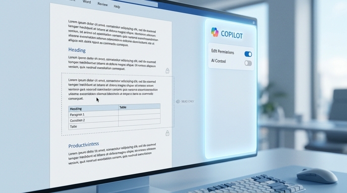
The most interesting part of this update may not be speed. It may be restraint.
PCWorld highlighted new controls that could let users limit Copilot’s behavior. For example, users may be able to keep Copilot in a read-only role or lock its attention to a specific section of a document. Fast Company also reported that users will have clearer controls over how Copilot interacts with their work, including ways to limit it to chat rather than editing, or focus it on a specific document section or spreadsheet area.
This is a big deal.
AI assistants become annoying when they overreach. Nobody wants a tool that eagerly rewrites the whole document when the request was “tighten this paragraph.” Nobody wants a spreadsheet assistant that changes formulas outside the target range like a caffeinated intern with admin privileges.
A good AI assistant needs boundaries.
Microsoft appears to be building more of those boundaries into Copilot. That could help users trust it. Trust does not come from magic. Trust comes from control, repeatability, and clear consequences. When users know what Copilot can touch, they can use it more confidently.
This is why the “leash” metaphor works. A leash is not punishment. It is control. It lets the dog run without letting it chase a bus.
Copilot needs exactly that.
Enterprise Software Wants to Feel Like Consumer Software
Fast Company reported that Microsoft’s Copilot changes will launch first for enterprise customers before expanding more broadly to business and consumer users. The company also studied how employees at partner companies actually use the product.
That is encouraging. Enterprise software has spent decades getting away with terrible interfaces because workers had no choice. The software did not need charm. It had procurement.
That era is fading.
Jacob Andreou, Microsoft’s EVP of Copilot, told Fast Company that the bar for enterprise software is now the consumer bar. Translation: if an app is ugly, confusing, slow, and unpleasant, users will compare it to the polished tools they use outside work. And they will not be kind.
This shift puts pressure on Microsoft. Copilot cannot just be powerful. It has to feel good enough to use repeatedly. That means faster load times. Better defaults. Fewer irrelevant buttons. Less friction. More direct answers. Cleaner handoffs between apps.
It also means Microsoft must solve a branding problem of its own making. The company has put Copilot branding across so many products that users can reasonably wonder which Copilot they are using and what exactly it can do. Fast Company noted that Microsoft has faced criticism for deploying AI features across a wide range of products, leaving some users bewildered by the many Copilots.
That criticism lands because it is obvious. Microsoft’s ecosystem has power, but it can also feel like a drawer full of remote controls.
This redesign looks like an attempt to label the remotes.
The Bigger Strategy: One Copilot, Many Places
Behind the interface changes sits a larger strategic move. Microsoft has been working to bring commercial and consumer Copilot efforts closer together. Fast Company reported that Microsoft named Jon Friedman as its first chief design officer for Microsoft 365 and installed Jacob Andreou as EVP of Copilot. The moves effectively merge teams focused on business and consumer Copilot products.
That does not mean work Copilot and personal Copilot become identical overnight. They cannot. Business AI must deal with compliance, access controls, data boundaries, and security expectations. Personal AI can be looser. Enterprise AI cannot act like a browser extension with a blazer.
But Microsoft clearly sees productivity as a “whole life” category. People use Word and Excel at work, school, home, and everywhere in between. A consumer may use Excel for a household budget. A business user may use it for financial modeling. The tool is the same family. The context changes.
That creates an opportunity for Microsoft. If it can make Copilot feel consistent across personal and professional settings, it gains an advantage over standalone AI tools. The selling point becomes integration. Copilot already sits near the files, inboxes, slides, spreadsheets, and meetings.
That is Microsoft’s strongest card. It does not need Copilot to be the flashiest AI assistant. It needs Copilot to be the most conveniently placed one.
In productivity software, convenience is not a small advantage. It is the whole battlefield.
Speed Helps, But Structure Matters More
The performance gains will grab headlines, and they should. Load times reduced by over 50% is not trivial. Complex chat prompts responding 10% faster at the slowest end is also meaningful. Waiting breaks flow. Slow software feels dumber than it is.
But speed alone does not fix AI.
A fast bad answer is still a bad answer. It just arrives with confidence and wastes your time sooner.
That is why Microsoft’s emphasis on structured responses matters. The company says Copilot now produces outputs that are easier to scan and better aligned with user intent. The Verge also emphasized that the assistant will provide more reliable and structured responses.
This is where AI productivity tools either win or become novelty toys. Workers rarely need a blob of text. They need a summary, a draft, a table, a decision list, an action plan, a revised slide, or a cleaner email. Format is not decoration. Format is usefulness.
If Copilot can understand when to produce bullets, when to draft paragraphs, when to suggest next steps, and when to stay concise, it becomes more valuable. If it cannot, users will copy its answer into another document and spend ten minutes cleaning it up.
That is not productivity. That is outsourcing the first mess and keeping the second.
The Risks Are Still Real
The redesign sounds sensible, but Microsoft still has hard problems to solve.
First, users need transparency. If Work IQ pulls context from emails, files, chats, and meetings, users must understand what it used and why. Otherwise Copilot becomes a black box wearing a productivity badge.
Second, editing controls must be obvious. If Copilot can change a document, users need clear signals before, during, and after those changes. Microsoft says the side pane will provide clearer signals so users know what Copilot is doing. That needs to work in practice, not just in a blog post.
Third, Microsoft must avoid turning Copilot into another layer of corporate noise. Suggested prompts can help. Too many suggested prompts become wallpaper. AI agents can help. Too many agents become yet another menu jungle.
Fourth, consumers and businesses have different tolerance levels for mistakes. A weird vacation-planning suggestion is annoying. A bad compliance summary is dangerous. Microsoft’s enterprise credibility depends on careful boundaries, not just clever features.
So the redesign is not a victory lap. It is a course correction.
A needed one.
Why This Update Actually Matters

Microsoft is not just giving Copilot a fresh coat of paint. It is trying to answer a basic question: how should AI fit into everyday work?
The first wave of AI tools often felt like a land grab. Put AI everywhere. Add buttons, Add sparkle. Add “generate” to every surface. That phase made noise. It also created fatigue.
This new Copilot design feels like a reaction to that fatigue. Microsoft seems to be saying: less spectacle, more flow. Less clutter, more context. Less “look at this AI feature,” more “finish the task.”
That is the right direction.
The future of workplace AI will not be decided by who has the loudest chatbot. It will be decided by who removes the most friction without creating new confusion. Microsoft has a massive advantage because it already owns the places where work happens for millions of people. But that advantage only matters if Copilot becomes genuinely easier to use.
This redesign gives Microsoft a better shot.
Copilot is getting faster. It is getting cleaner. It is getting more contextual. Most importantly, it is getting boundaries.
For an AI assistant inside office software, that may be the real breakthrough. Not a bigger brain. Not a shinier button. A better sense of when to help, where to help, and when to stop.
That sounds simple.
It is not.
But if Microsoft gets it right, Copilot may finally become what it has always promised to be: not a gimmick, not a pop-up, not a digital confetti cannon, but a useful layer of intelligence woven into the work people already do.
And if it gets it wrong?
Well, at least it will load faster.
Sources
- The Verge: “Microsoft 365 Copilot gets a speed boost and cleaner design”
- PCWorld: “Microsoft is putting Copilot on a productivity leash”
- Microsoft 365 Blog: “Introducing a new design for Microsoft 365 Copilot”
- Neowin: “Microsoft 365 Copilot gets a major redesign and performance boost”
- Fast Company: “Microsoft’s AI Copilot is getting a human-focused streamlining”
Microsoft 365 Copilot
Microsoft Copilot
Copilot Learning
The Kingy Brief
Get The Kingy Brief.
AI changes, original tests and one practical thing to try. Fridays at 09:00 Vancouver time.
Free · Double opt-in · Unsubscribe anytime
Signup help and newsletter schedule
Signup form provided by Beehiiv. After submitting, check your inbox for "Confirm your subscription to The Kingy Brief" and open its confirmation link. Check Spam or Promotions if you cannot find it.
Fridays at 09:00 Vancouver time: source-checked AI changes, original tests and one practical thing to try. The weekly restart begins October 9, 2026. We skip a week when there is not enough verified material. Free. Unsubscribe anytime.