
A deep-dive into the AI Site Builder reshaping how marketing websites get planned, wireframed, and shipped — based on a hands-on walkthrough and Relume’s official documentation.
There’s a quiet problem in web design that nobody talks about at conferences. It’s not picking the right framework, or arguing about Figma versus Sketch, or even the eternal Tailwind-versus-vanilla-CSS debate. The real problem — the one that eats hours of billable time and makes clients squint at mood boards — is figuring out what the website should actually be before a single pixel gets pushed.
What pages do we need? What sections live on the homepage? What’s the visual direction? What does the hero say?
Relume has decided that this messy, ambiguous, painful pre-design stage is exactly where AI should help. Not in the “generate me a finished website” sense that most AI builders chase, but in the much more useful “help me plan the damn thing” sense. After spending serious time with the platform — guided by the hands-on YouTube walkthrough embedded above — I’m convinced this is one of the few AI tools designers will keep using a year from now.
This is a full review of what Relume is, how it works, where it shines, where it stumbles, and whether the price tag is worth it. For more AI tooling breakdowns, you can browse the AI tools coverage at kingy.ai.
What Relume Actually Is
Relume positions itself as an “AI design ally, not a replacement” — and that framing matters. According to its official homepage, the platform exists to “instantly generate Sitemaps, Wireframes and Style Guides for marketing websites — all in minutes.”
It’s not Wix. It’s not Framer. It’s not trying to render a finished, deployed website from a prompt. Instead, Relume slots itself into the pre-production phase of a typical web design project — the part that, in agency life, used to involve a Miro board, a Notion doc, three rounds of stakeholder calls, and a Figma file that grew to 87 frames before anyone agreed on the navigation.
The product suite is broader than the AI Site Builder alone. Per Relume’s product menu, the ecosystem includes:
- AI Site Builder — the flagship sitemap/wireframe/style guide generator.
- Webflow Library — 1,000+ Client-First Webflow components.
- Figma Library — 1,000+ Figma components (free).
- React Library — 1,000+ React components built with Tailwind CSS and Shadcn UI.
- Style Guide Builder — on-brand design concepts in minutes.
- Chrome Extension — productivity boosts inside Webflow.
- Relume Ipsum — AI copywriting inside Figma.
- Relume Icons — open-source icons for Webflow and Figma.
The company also claims over 1 million designers and developers trust the platform, with 500,000+ websites built using it (the video cites slightly older “500,000+ designers / 2 million websites” stats — both figures are credible and reflect a tool that has clearly graduated from indie experiment to industry fixture).
For context on similar AI-driven creative workflows, kingy.ai’s AI design coverage has tracked the broader shift toward tools that augment rather than replace human designers, and Relume is arguably the cleanest example of that philosophy in production today.
The Workflow: Prompt → Sitemap → Wireframe → Style Guide → Export
The video walkthrough makes one thing immediately clear: Relume isn’t a chatbot wrapped in a UI. It’s a structured pipeline with four distinct stages, and you move through them like a designer would — not like someone “chatting” their way to a website.
Stage 1: The Sitemap
You start at relume.io and hit “Start for free.” After signing up, you create a project. Two options: build from scratch, or import an existing sitemap by pasting a URL — a deceptively useful feature when you’re redesigning a client’s existing site and don’t want to manually transcribe their information architecture.
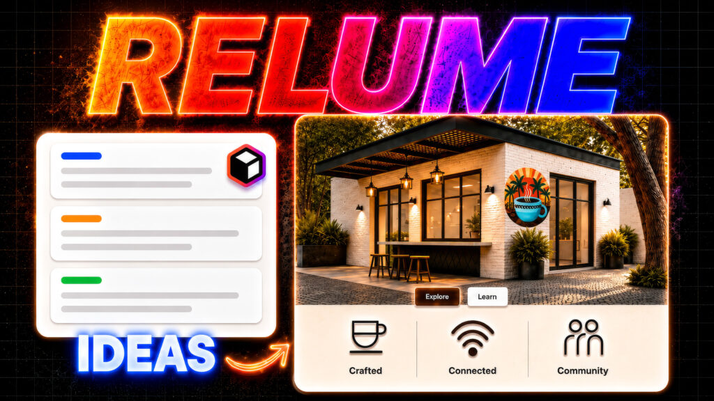
In the video, the reviewer builds a coffee shop for digital nomads, feeding in a fairly detailed prompt covering dedicated work areas, fast Wi-Fi, community events, and a “premium coffee experience” with a visual emphasis on architecture rather than people. He sets the page count (anywhere from 1 to 20+) and the language, then hits Generate sitemap.
What happens next is the thing that makes Relume feel different from every other AI tool: a full marketing-site sitemap appears in seconds. Not vague suggestions — actual section-by-section structure:
- Navbar
- Hero Header
- Feature Sections (dedicated work areas, fast Wi-Fi, premium coffee)
- Features List Section (community events)
- Stats Section
- Testimonial Section
- Gallery Section
- CTA Section
- Newsletter Section
- FAQ Section
- Footer
You can add sections with a “+” icon, rename them, delete them, duplicate them, or edit the underlying prompt for any individual section. This is the part that converts skeptics. The sitemap isn’t a one-shot black box; it’s a manipulable structural document.
Stage 2: Wireframes
Click the Wireframe tab and Relume turns the sitemap into actual wireframes — populated with real components from the Relume library and placeholder copy generated specifically for the prompt. No lorem ipsum. No generic stock layouts. The reviewer’s coffee shop appears as “Cozy Tropics Café Co-Working Space,” with hero text, feature descriptions, and CTAs that read like a junior copywriter wrote a competent first draft.
This is where the AI editing tools start earning their keep. Click any section and a side panel opens with the original prompt that generated it. You can:
- Regenerate the entire section’s copy.
- Use the Ask AI dropdown to rewrite, shorten, lengthen, set a specific line count, fix spelling/grammar, improve writing, simplify language, or change tone.
- Manually edit any block of text for precise control.
The reviewer leans on “make shorter” repeatedly — and rightly so. The initial AI copy tends toward verbose marketing-speak, which is a fair criticism of the tool’s default output. But the fix is one click, not one hour, and that’s the point.
Wireframes can also be swapped, replaced with other components from the Relume Library, or reordered. The whole thing remains structural rather than decorative — exactly the discipline that good designers try (and usually fail) to maintain at this stage.
Stage 3: The Style Guide
This is where Relume goes from “useful” to “uncomfortably impressive.” The Style Guide tab generates a starting visual direction immediately — colors, typography, button styles, card and image treatments — and previews the entire wireframe with those styles applied in real time on the right side of the screen.
Key controls demonstrated in the video:
- Shuffle colors — dynamically reroll the palette across neutral, main, and accent colors.
- Lock colors — pin a brand color so subsequent shuffles can’t touch it.
- Fine-tune individual colors — pick exact shades when shuffling lands you close-but-not-quite.
- Custom image uploads — drop in real brand imagery (the reviewer swaps placeholder images for actual coffee-themed visuals and a logo).
- Image controls — ratio, position, fill mode, width, shape, overlay, and foreground color.
- Typography shuffling — swap heading and body fonts via Google Fonts (the reviewer searches for and applies “Space Mono”), with weight, size, and style controls.
- UI styling presets — Default, Bubble, Brick, Gradient, Sleek for buttons; Default, Outlined, Flat, Edgy for cards and images.
- Per-section background colors — paint individual sections from the active palette.
- Mobile preview — instant responsive view to check layout integrity.
Then comes the feature that genuinely changes the client-services workflow: Concepts.
You can spin up multiple full design concepts, each with its own stylesheet, automatically generated with different color schemes and typography directions. The reviewer creates two additional concepts in seconds. Then he clicks Pitch Concepts, which organizes all the variations side-by-side into a shareable view, copies a link, and sends it for client feedback.
If you’ve ever spent a day in Figma duplicating frames to produce three “directions” for a client pitch, this feature alone justifies a subscription.
Stage 4: Export
Once a concept is approved, Relume exports to:
- Figma (via the free Relume Figma Kit — over 1,000 components with mobile variants)
- Webflow (copy and paste components directly, built with Finsweet’s Client-First conventions)
- React (built with Tailwind CSS and Shadcn UI, copyable as React or HTML)
- Claude Design (the newer integration teased at the end of the video for taking projects into a more polished, launch-ready state)
The export model is refreshingly pragmatic. Relume doesn’t try to be the destination — it tries to be the fastest possible runway to the tool you already use. The official site puts it bluntly: “Site Builder works with the tools you already love and respects your process.”
What Makes Relume Genuinely Different
Most AI website tools fall into one of two traps. They either generate a “finished” site that looks AI-generated (because it is), or they hide behind a chat interface that requires constant re-prompting to fix tiny issues.
Relume’s approach — and this is the central insight of the video walkthrough — is that structure precedes style. The platform forces you (gently) through sitemap → wireframe → style guide in that order. You’re not generating finished pages from a single prompt; you’re generating a plan that you then refine, restyle, and export.
The reviewer puts it well: unlike AI builders that rely on constant prompting and produce inconsistent output, Relume “provides a clear structure and backend from the very beginning.” It mimics the workflow a senior designer at a competent agency would actually use — discovery, IA, low-fi, style direction, hand-off — except compressed from weeks into about 30 minutes.
For broader perspective on how this fits into the modern AI design stack, the AI workflows section at kingy.ai has tracked this exact shift: tools that win are the ones that respect existing professional processes rather than trying to replace them wholesale.
Pricing: Where It Gets Spicy
Per the Relume pricing page, the plans have recently been restructured into Free, Design, Build, and Grow tiers (with the older Starter/Pro/Team naming still visible in some comparison tables on the site).
The free tier is genuinely usable as an evaluation:
- 1 user, 10 projects, sitemap + wireframe + style guide tools.
- 20 wireframe pages.
- 30 Webflow components, 1,500+ Figma components.
- View-only sharing.
- No exports (this is the upgrade nudge).
The paid tiers unlock:
- Unlimited wireframe pages and projects.
- Export to Figma, Webflow, React, and HTML.
- The full 1,500+ Webflow component library and 1,500+ React components.
- View-and-comment sharing for collaboration.
- Team Workspace (Grow plan only, minimum 3 users).
- Chrome Extension features including Class Sync, automations, and the SVG Icon Converter.
A 7-day free trial is available for paid plans, and Relume offers a 10-day refund window if you email support@relume.io. The company estimates the average Webflow project is worth around $5,000 USD and pitches subscription cost as “less than 1% of your next project” — which, depending on your rates, is either a steal or a marketing flourish, but isn’t unreasonable.
Existing customers on legacy plans are grandfathered at original pricing (per the FAQ), which is a nice touch in a SaaS market where price hikes often hit existing users hardest.
One operational note: support runs through Slack (slack.relume.io), not a ticketing system. For account issues there’s support@relume.io, but anything technical happens in the community. This is fine if you like Slack communities and slightly annoying if you don’t.
What Relume Does Well
Speed. Sitemap in seconds. Wireframes in another few seconds. Style guide instantly. The reviewer’s coffee shop project goes from blank screen to multi-concept pitch-ready in roughly the length of a coffee break.
Structure-first thinking. By separating sitemap, wireframe, and style guide into distinct stages, Relume enforces the kind of discipline that prevents the “we built the homepage three times because the client kept changing the strategy” disaster.
Component quality. This isn’t AI-generated junk. The library is curated, built on Finsweet’s Client-First Webflow conventions, and refreshed on the first Monday of every month (Relume calls it “Component Day”). The React library uses Tailwind and Shadcn UI — modern, sensible defaults.
Export flexibility. Figma, Webflow, React, HTML, and now Claude Design. Relume meets you wherever you actually ship from.
Concepts and Pitch view. Genuinely novel feature for agency workflows. Generating three styled concepts and sharing them via link in a few clicks replaces hours of duplication work.
Real-time client collaboration. Share links with view-and-comment access on paid plans, with comments threaded into the project.
Mobile responsiveness baked in. Mobile preview is one click, and Figma components ship with mobile variants.
Where Relume Could Improve
Default copy is wordy. The AI’s first drafts read like enthusiastic marketing copywriters who haven’t been told to chill out. The reviewer constantly uses “Ask AI → make shorter” to fix it. Not a dealbreaker, but the defaults could be tighter.
Marketing site focus. Relume is laser-targeted at marketing/brochure websites. If you’re designing a complex SaaS dashboard, an e-commerce platform, or a web app, this isn’t your tool. The official copy says so directly: “Sitemaps, Wireframes and Style Guides for marketing websites.”
Browser limitations. The Relume Library copy/paste functionality doesn’t work in Safari — Chrome, Firefox, or Edge only. Awkward for Mac-first designers.
The Verdict
Relume is the rare AI tool that respects its users’ professionalism. It doesn’t try to make designers obsolete, it doesn’t pretend the messy planning phase doesn’t exist, and it doesn’t lock you into its own walled garden. It compresses the slowest, most expensive part of marketing-site work — the planning — into a process that takes about 30 minutes instead of three days, and then hands the output to whatever tool you actually ship from.
The reviewer in the YouTube walkthrough is correct: Relume’s workflow mirrors what professional designers already do, but makes it accessible to anyone with a clear brief and a credit card. The tool’s positioning — “AI as your design ally, not a replacement” — isn’t just marketing. The product genuinely behaves that way.
For freelancers and agencies building marketing sites in Webflow, Figma, or React, Relume is the closest thing to an unfair advantage currently on the market. For solo founders trying to ship a landing page without hiring a designer, the free tier is a viable starting point and the Design plan trial is worth a week of your attention. For full no-code beginners with no Webflow experience, expect to invest some time learning the destination tool — Relume accelerates planning, but it doesn’t eliminate the need for craft.
The pricing is fair, the component library is excellent, the AI is competent rather than miraculous, and the workflow is the most thoughtful I’ve seen in this category. If you’re building marketing websites and you’re not at least running a Relume trial this quarter, you’re leaving billable hours on the table.
For more reviews of AI tools that are actually worth the subscription, head over to kingy.ai — and try Relume for free at relume.io.