The “Mega Chart Screwup” That Overshadowed a Major AI Milestone
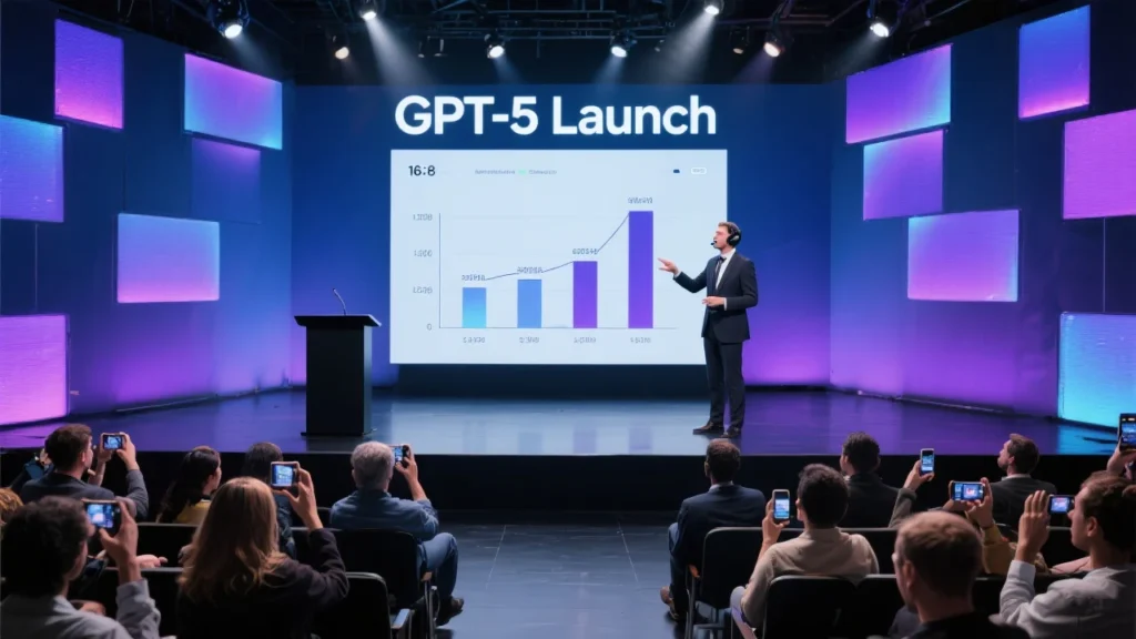
OpenAI’s highly anticipated GPT-5 launch on Thursday should have been a triumphant moment for the artificial intelligence company. Instead, what was meant to showcase the cutting-edge capabilities of their latest model became overshadowed by a series of embarrassing chart errors that sparked widespread criticism and forced CEO Sam Altman to issue a public apology.
The controversy erupted during OpenAI’s livestream presentation when eagle-eyed viewers noticed glaring inconsistencies in the company’s benchmark charts. These weren’t minor formatting issues or aesthetic choices they were fundamental mathematical errors that made the data visualization completely misleading.
The Charts That Sparked Outrage
The most egregious example appeared in a chart comparing GPT-5’s performance against OpenAI’s o3 model on “coding deception” metrics. According to the displayed numbers, GPT-5 had a 50.0 percent deception rate compared to o3’s 47.4 percent score. However, the visual representation told a completely different story o3’s bar appeared significantly larger than GPT-5’s, despite having a lower numerical value.
This wasn’t an isolated incident. Another chart comparing GPT-5, o3, and GPT-4o showed equally problematic visualizations. The chart displayed GPT-5 with a score of 74.9, o3 with 69.1, and GPT-4o with 30.8. Yet the bars for o3 and GPT-4o appeared nearly identical in size, despite the massive difference in their scores. Meanwhile, a separate metric showed a bar for 52.8% that was taller than one representing 69.1%.
As The Verge reported, these errors were so obvious that they immediately caught the attention of data visualization experts and tech journalists watching the presentation.
Swift Damage Control
The backlash was immediate and intense. Sam Altman quickly took to social media, acknowledging what he called a “mega chart screwup.” In his characteristic direct style, the OpenAI CEO didn’t try to downplay the errors, instead owning up to the mistakes while directing people to the corrected versions in the company’s blog post.
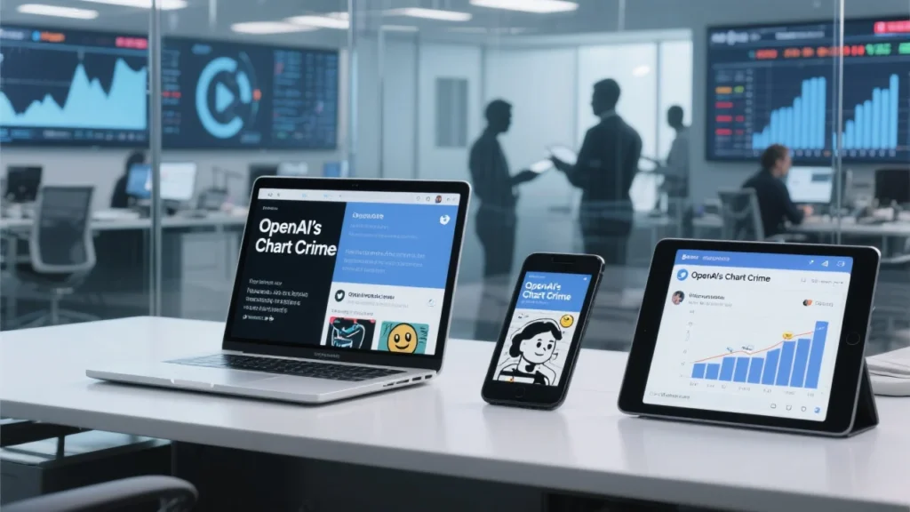
An OpenAI marketing staffer also jumped into damage control mode, posting on X (formerly Twitter): “We fixed the chart in the blog guys, apologies for the unintentional chart crime 🙏.” The phrase “chart crime” quickly became a meme within the tech community, highlighting how seriously data visualization errors are taken in an industry built on precision and accuracy.
The Human Factor Behind the Errors
In a Reddit AMA on Friday, Altman provided more context about how these errors occurred. “The numbers here were accurate but we screwed up the bar charts in the livestream overnight; on another slide we screwed up numbers,” he explained. He attributed the mistakes to human error, noting that “people were working late and were very tired, and human error got in the way. A lot comes together for a livestream in the last hours.”
This explanation, while understandable from a human perspective, raised questions about OpenAI’s quality control processes. For a company positioning itself as a leader in artificial intelligence and accuracy, such fundamental errors in data presentation seemed particularly problematic.
The Irony of Inaccurate Charts
The timing of these chart errors couldn’t have been worse for OpenAI. The company was specifically touting GPT-5’s “significant advances in reducing hallucinations” essentially, its improved ability to provide accurate information rather than making things up. One of the flawed charts even dealt with “deception evals,” measuring how well the model performs in scenarios involving potential deception.
As FlowingData pointed out, “it’s not the best look to use a botched chart when talking about the accuracy of a tool that requires high user trust.” The irony was palpable a company promoting its AI’s improved accuracy was simultaneously presenting wildly inaccurate visual data.
Industry Reaction and Broader Implications
The chart controversy quickly became a talking point across the tech industry. Data visualization experts used it as a teaching moment about the importance of accurate chart creation, while critics questioned whether the errors were indicative of broader quality control issues at OpenAI.
The incident also highlighted the intense scrutiny that major tech companies face during product launches. Every detail is analyzed, screenshotted, and shared across social media platforms. In an era where misinformation is a constant concern, accuracy in data presentation has become more critical than ever.
GPT-5’s Actual Capabilities Overshadowed
Unfortunately for OpenAI, the chart controversy overshadowed what should have been the main story: the impressive capabilities of GPT-5. According to Live Mint, the new model represents a significant advancement in AI technology, featuring major improvements in accuracy, speed, reasoning, context recognition, structured thinking, and problem-solving.
The model introduces a unified system where an “efficient model” handles normal tasks while a dedicated reasoning model called “GPT-5 Thinking” manages more complex reasoning-based queries. This represents a significant architectural improvement over previous versions.
The Corrected Data Tells a Different Story
When OpenAI published the corrected charts in their blog post, the actual performance metrics painted a much more accurate picture of GPT-5’s capabilities. The corrected deception rate for GPT-5 was listed as 16.5 percent significantly different from the 50 percent figure shown in the livestream chart.
These corrections revealed that GPT-5 does indeed perform better than its predecessors in most benchmarks, but the initial presentation errors had already damaged the credibility of these claims in the eyes of many observers.
Lessons in Data Visualization
The OpenAI chart controversy serves as a masterclass in why accurate data visualization matters. Charts and graphs aren’t just decorative elements in presentations they’re powerful tools for communicating complex information quickly and effectively. When they’re wrong, they can completely undermine the message being conveyed.
Data visualization experts have long emphasized that charts should make data easier to understand, not more confusing. The basic principle that bar heights should correspond to the values they represent is fundamental to effective chart design.
The Broader Context of Tech Demo Failures
As Business Insider noted, OpenAI isn’t the first tech company to experience demo failures. Microsoft’s Bing AI chatbot made several mistakes during its 2023 unveiling, and Google’s Bard (now Gemini) gave an incorrect answer about the James Webb Space Telescope in an advertisement.
These incidents highlight the challenges of live demonstrations in the tech industry, where the pressure to showcase cutting-edge capabilities can sometimes lead to oversights in quality control.
Moving Forward: Trust and Transparency
The chart controversy raises important questions about trust and transparency in the AI industry. As these companies develop increasingly powerful tools that people rely on for accurate information, the standards for their own communications must be equally high.
OpenAI’s quick acknowledgment of the errors and transparent explanation of how they occurred demonstrates good crisis management. However, the incident also serves as a reminder that even the most advanced AI companies are still run by humans who make mistakes.
The Competitive Landscape
Given the intense competition in the AI space, the timing of this controversy carries particular significance. With companies like Google, Microsoft, and Anthropic all vying for dominance, competitors and critics alike can seize on any misstep.
The chart errors provided ammunition for those questioning OpenAI’s claims about GPT-5’s superiority over competing models. In an industry where benchmarks and performance metrics are crucial for establishing market position, accuracy in presenting this data is paramount.
Conclusion: A Teachable Moment

OpenAI’s “chart crime” ultimately serves as a valuable lesson for the entire tech industry. It demonstrates the importance of rigorous quality control, especially when presenting data that supports key business claims. It also shows that companies should respond quickly and transparently when they discover errors.
While the corrected data in OpenAI’s blog post likely provides an accurate representation of GPT-5’s capabilities, the initial presentation errors created unnecessary doubt and distraction from what appears to be a genuinely impressive technological advancement.
As the AI industry continues to evolve and mature, incidents like this remind us that behind every sophisticated algorithm and groundbreaking model are human teams working under pressure to deliver results. The key is learning from these mistakes and implementing better processes to prevent them in the future.
The “mega chart screwup” may have temporarily overshadowed GPT-5’s launch, but it also provided a valuable reminder about the importance of accuracy, transparency, and humility in an industry that’s reshaping the world.